Visualisation of measurement data
Challenges in the hardness determination project
In destructive hardness testing, an indentation is made in the material. The equipment used and the evaluation criteria differ depending on the method. What all methods have in common, however, is that they only allow the hardness to be determined selectively. In contrast, the µmagnetic QASS measuring system enables continuous measurement along a path, e.g. on a sheet or an endless strip. In contrast to other applications of the QASS Optimiser, in which the process cycle is measured in seconds or minutes, here we are dealing with analysis and recording durations of hours or days. As the raw data volume exceeds 2 TB per day, effective analyses and compressions are required.
Efficient data processing and reduction
Skilful filtering and compression are crucial to the success of data analysis. There are ML methods with which we can find the relevant attributes in the data. We first save uncompressed raw data, then select suitable compressions and filters and generally work on reduced data that still contains the important information or even emphasises it. Raw data is deleted on a rolling basis so that a current raw data stock can always be retained. It should be possible to visualise the data in its respective compression levels, so that we "humans" can check it for plausibility. Process data that have an influence on the measured magnetic field response are recorded in parallel in order to be able to compensate for their influence in the further course (for example, the distances of the sensor from the metal surface). Other data may correlate with observed changes in hardness (duration of heat treatment, alloy changes).
Visualisation of time series data
There are different options depending on the type of data to be visualised. For time series, i.e. data that changes over time, lines and scatter diagrams are suitable. These can be realised in Python without much effort. Figure 1 shows a short programme for drawing a sine curve. The data is contained in the two arrays X_arr contains the x-values, which range from -10 to 10 with a step size of 0.2. Y_arr contains the corresponding sine values.
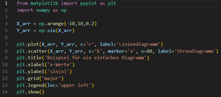
Figure 1: Python programme example for a line and scatter diagram.
The result is shown in Figure 2. It is just as easy to read data from a CSV file instead of calculating values.
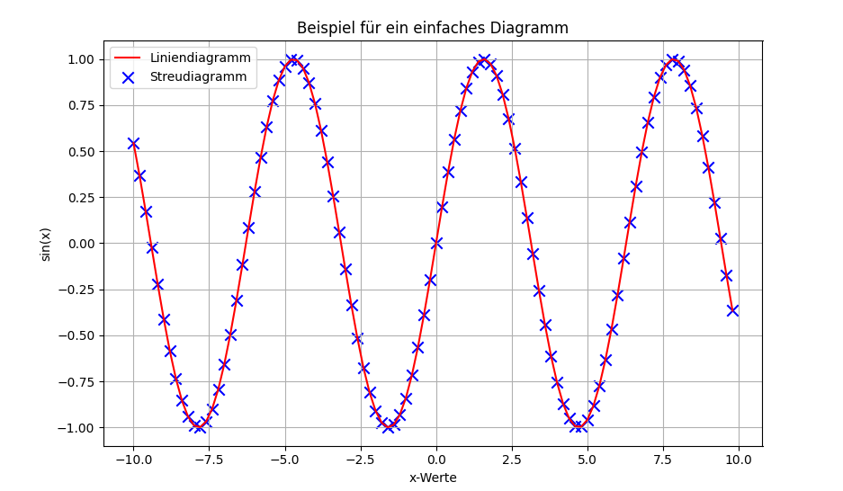
Figure 2: Result of the programme example in Figure 1.
This is exactly what has been done in Figure 3. Visualisation in the browser with streamlit: measured energy values (orange), laser-measured distance values (blue) shown in the upper half of the diagram. The lower half, on the other hand, shows the process temperature (red) and the feed rate (white).
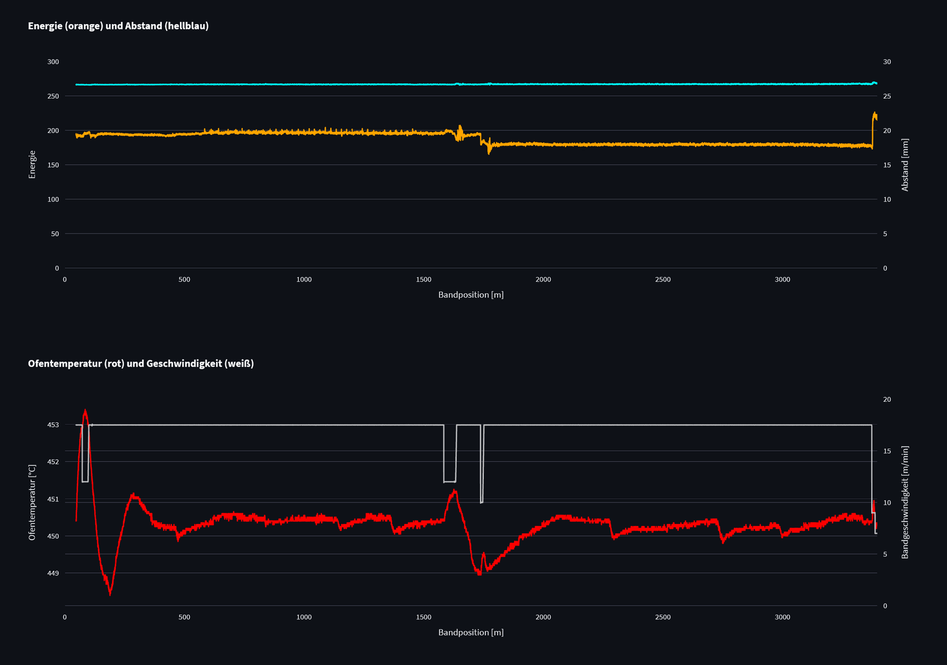
Figure 3: Time series diagrams in a QASS application.
It is interesting to see from Figure 3 that changes in speed have an effect on the measured energy values and thus on the hardness values based on them. The lower speed causes a longer dwell time in the heating zone, which leads to a greater decrease in hardness and manifests itself in increased energy values.
Visualisation of multidimensional data
The data are not always time series. Sometimes they are arrays that describe an area or the change in several variables. The QASS µmagnetic measuring system utilizes a physical effect that was discovered around 100 years ago, in 1918, by the German physicist Heinrich Georg Barkhausen and which occurs exclusively in ferromagnetic materials.
Unlike Heinrich Georg Barkhausen, who called the phenomenon Barkhausen noise because he made the magnetic processes taking place inside materials audible, QASS applies the methods of spectral analysis to the noise. After the Fourier transformation, the time-amplitude signal is available as a time-frequency-amplitude signal. Figure 4 is a short Python program that uses real measured data. The data is available as a three-dimensional array with the resolutions (93, 64, 78).
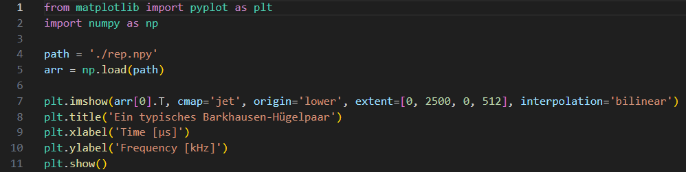
Figure 4: Python program example to visualise arrays or area data.
Shown is the mean value over all Barkhausen hill pairs in a 1.3 second interval, as would be seen after the Fourier transformation in the QASS Analyzer4D software. The image is shown in Figure 5. Each of these colour-coded hills corresponds to the material response of a magnetisation in one direction. The frequency of the alternating magnetic field is 400Hz. This means that one period, which corresponds to two changes in magnetic orientation, lasts 2.5 milliseconds.
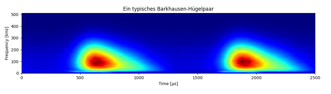
Figure 5: Real measured result of a µmagnetic measurement.
Figure 6 shows another example of a surface. Here, the surface of teeth in a ring gear, as found in planetary gearboxes for wind turbines, was analysed for grinding burn. The measurement result of artificially introduced anomalies is shown in concrete terms.
The analysis is also realised by non-contact measurement of Barkhausen effects. However, the exciting magnetic field is alternated at 4 kHz to detect even thin-layer hardness anomalies caused by grinding errors. The sensor is guided along the tooth at approx. 600mm/s.
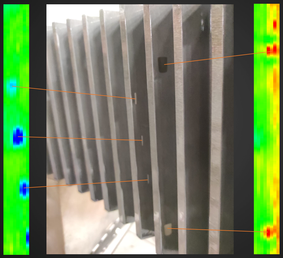
Figure 6: Example of artificially introduced anomalies in the tooth flanks of a ring gear.
Figure 7 shows the findings for tooth flanks without grinding burn and Figure 8 shows how grinding burn appears in the measurement result.
Green corresponds to the reference hardness, Red to a new hardness zone and Blue to a tempering zone.
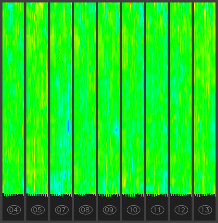
Figure 7: Real µmagnetic measurement of tooth flanks without grinding burn.
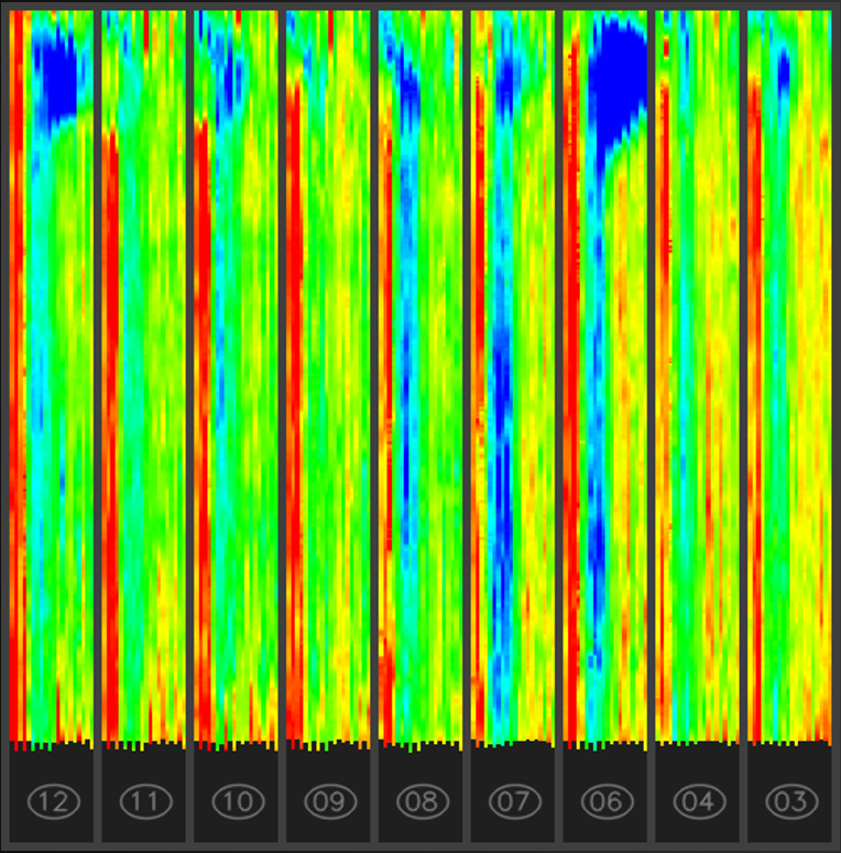
Figure 8: Real µmagnetic measurement of tooth flanks with grinding burn.
The solution for user-friendly GUIs and diagrams
It is obvious that the creation of appealing diagrams is unproblematic. Nevertheless, writing a separate small programme for each new component, gear or sheet metal requires a corresponding amount of effort. The programme example in Figure 4 shows in line 4 that the path to the file is specified there. If a different file were specified there, or better still a mechanism for selecting a file from a list, then we would be a big step further.
To create such a user interface (GUI from Graphical User Interface), Streamlit is available under Python. Streamlit is a library that provides exactly that in an Internet browser. Figure 9 shows a small programme example for selecting a file from a list. The result (excerpt) can be seen in Figure 10. Less than 10 lines of programme code are required to lay the foundation for this type of functionality.
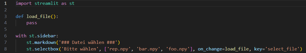
Figure 9: Python programme body for a Streamlit application
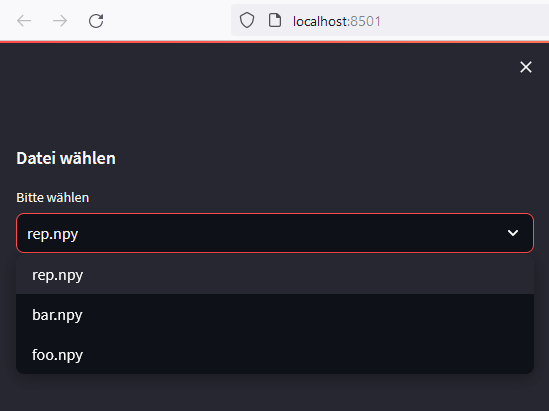
Figure 10: Result of the programme body in Figure 9 (excerpt from a web browser).
Finally, the following illustrations show pages from Streamlit applications that provide as much information as possible for assessing the process flows.
We use them both during prototyping and later as a user GUI.
This page is a page with input fields, buttons, diagrams and tables whose contents change under programme control after certain entries have been made.
The pages can be shared live via the Internet.
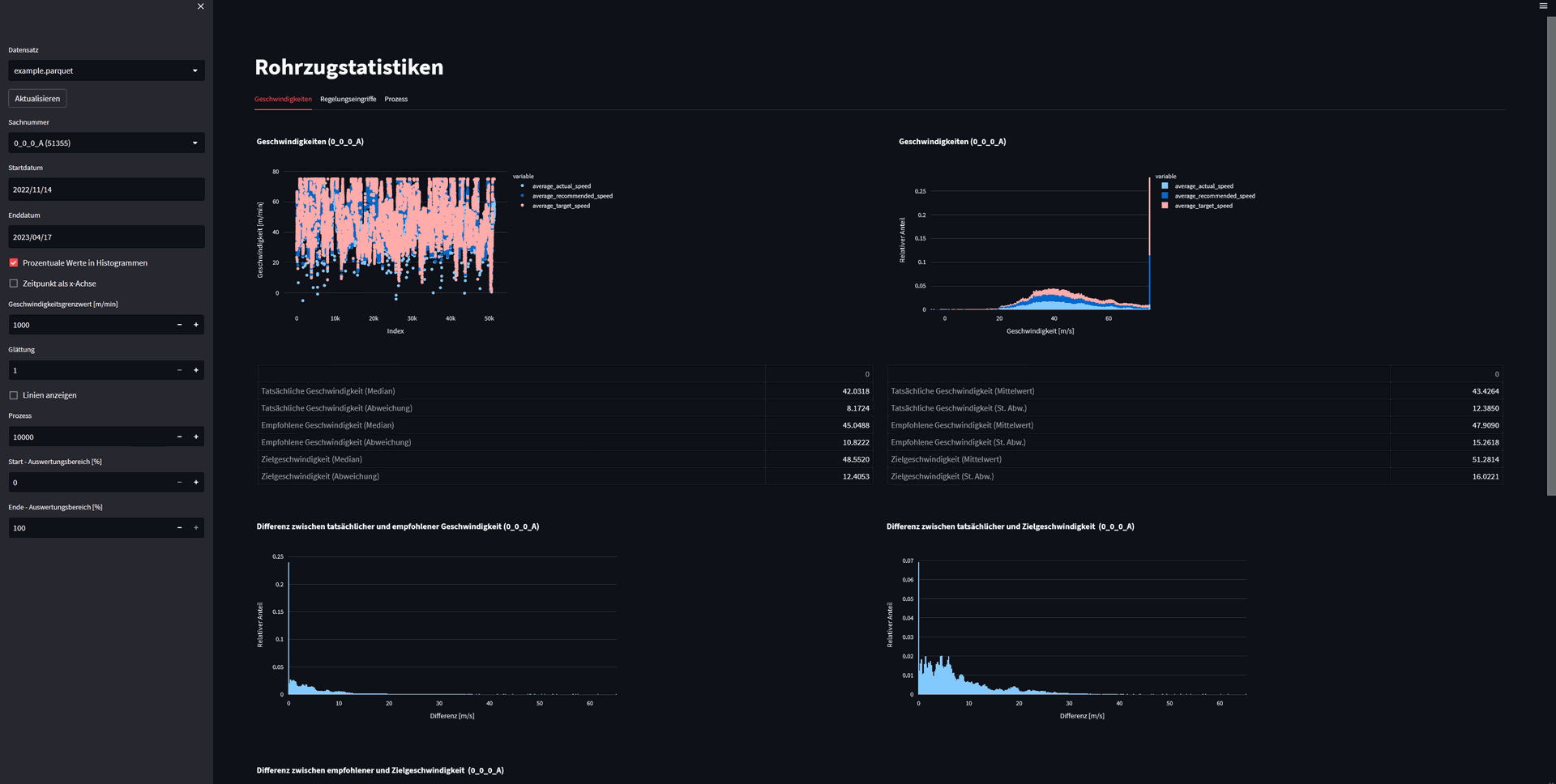
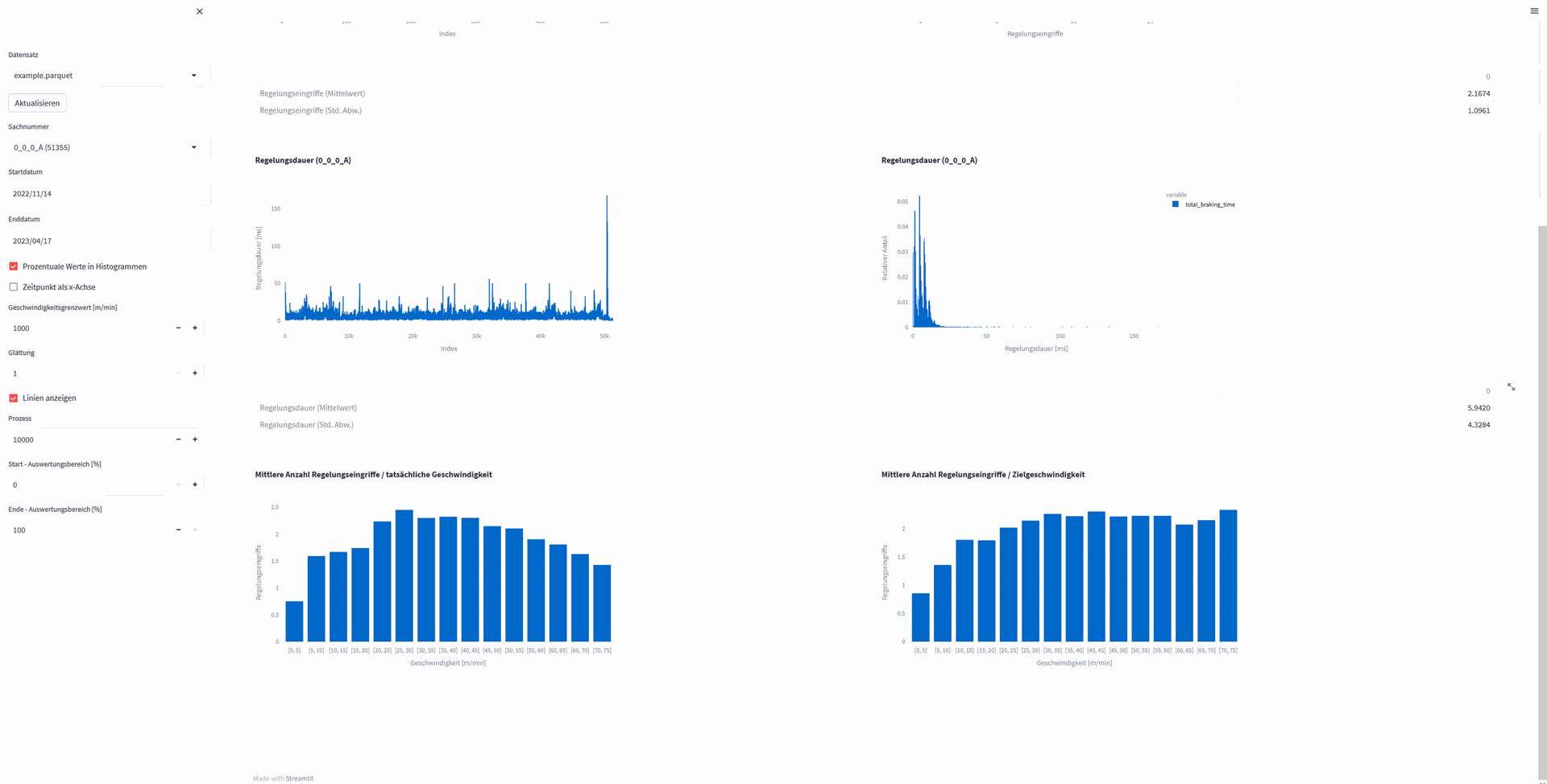
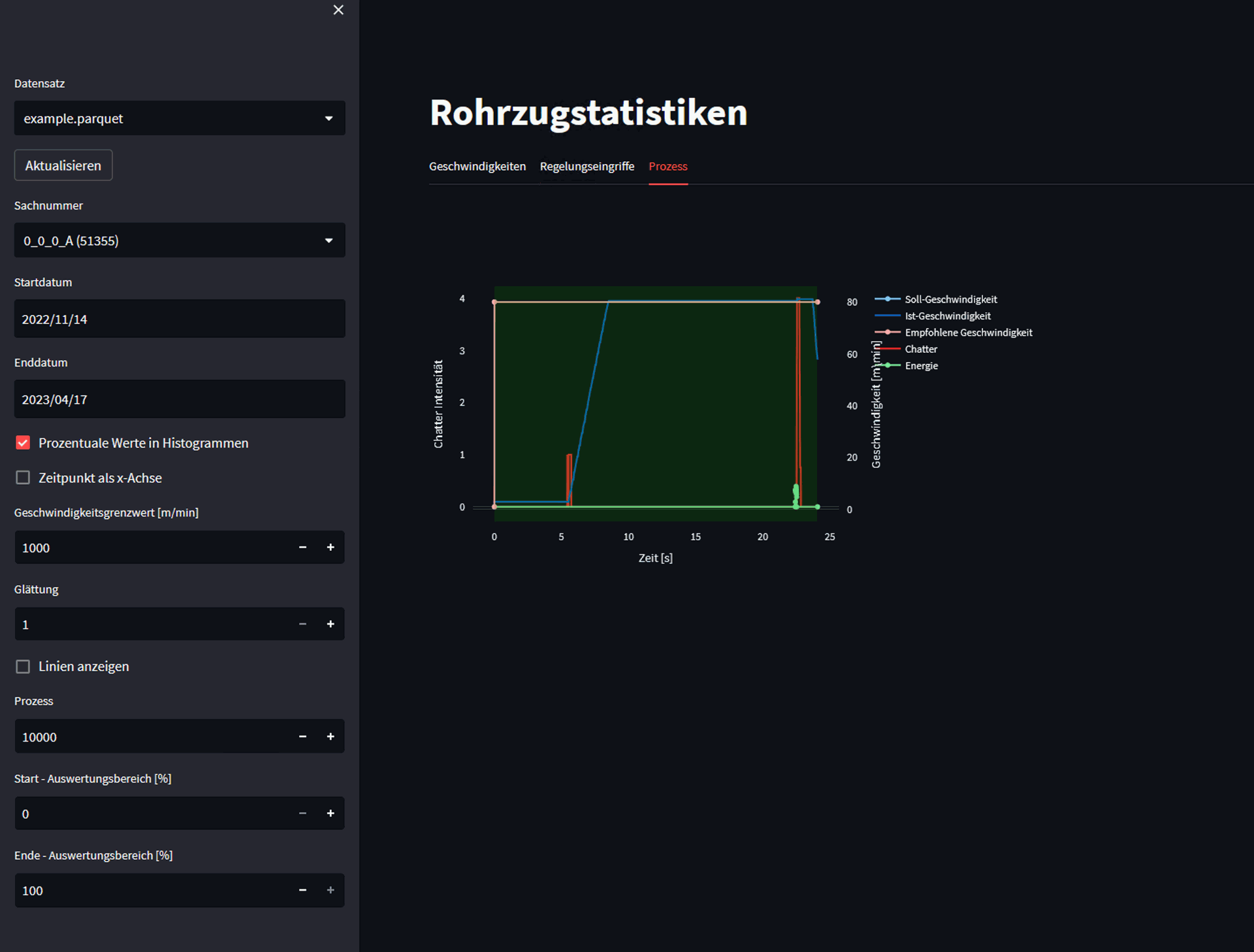
QASS Streamlit application